The Problem
Bank finance long forms infamously intimidate users—and cause them to leave web & app without finishing the form—because long forms look like they require a lot of effort to complete.
At consumer end:- How to increase consumer experience by reducing the steps of bike finance and get the desire information in minimum time.
At the business end:- to increase quality lead, have to make it more engaging and personalized to capture good quality leads. How we can we give best experience once we collect the lead?
Optimization of Bike Finance Form
OVERVIEW
BikeDekho.com facilitates its consumers to find their right bike/scooter. Consumers can view on-road prices, colors, compare, read reviews and the latest bike news. Begin a repudiate platform banks are collaborated with BikeDekho to help the consumer to avail finance lone at best rates.
The aim of this project was to solve the problem of the buyers who are looking for bike finance loans at the best rates without paperwork in minimum time. With this said engagement and trust-building should help to increase lead conversion.
ROLE & DURATION
Lead Product Designer | BikeDekho
User Research, Interaction, Visual Design, Prototyping & testing
Feb - Sep 2020
PRODUCT


User Research
A 5-day workshop was conducted with the stakeholders, bank officers, ops team, and consumers looking for bike finance.
-
Understating the finance process with stakeholders and bank officers.
-
Roles and responsibilities of bank officers at each level of the process.
-
Understating the types of quires from the operation team.
-
Understating the current paint points of banks and consumers.
-
How is the success of the tasks measured?
Qualitative Interviews
User research was quintessential. The complex flows of the user and their interactions with the app needed to be laid out in detail. In order to achieve that, I gathered as much as I could from the end-users to understand the challenges they face and how they see the app making a difference in optimizing pain areas.
“With all of our communication over WhatsApp or Phone calls, it's a tedious task as a bank officer to manage multiple clients when the maximum lead is captured in festival season.”
- Bank Authorities
“I need a loan at a better rate of interest, but I am not able to complete the form due to multiple steps, sometimes I lose the information which I filled in, it is very difficult and time taking to refill all the information. I prefer a phone call to save my time”
- Consumer
“I get multiple calls in a day asking about the loan requirement. Sometimes it is very frustrating to give the same details multiple times. I try to write them down on paper but it’s difficult to keep a track of them.”
- Consumer
User Flows
Next, I created a user flow chart based on the research. It helped me to figure out the key actions a user has to perform while applying for a bike loan. Through this process, I was able to identify the key screens that I need to create and design in the later phase.

Insights
After conducting countless user interviews, contextual inquiry, and analyzing the gathered data, I was able to categorize the insights into the following user profile.

User Profiles
The research made it evident how different users would use the app differently. To cater to this, I categorized them into three user profiles based on their goals and tasks
First Profile
First Profile
First Profile
“With all of our communication over WhatsApp or Phone calls, it's a tedious task as a bank officer to manage multiple clients when the maximum lead is captured in festival season.”
Second Profile
Secound Profile
Secound Profile
“I need a loan at a better rate of interest, but I am not able to complete the form due to multiple steps, sometimes I lose the information which I filled in, it is very difficult and time taking to refill all the information. I prefer a phone call to save my time”
Third Profile
“I get multiple calls in a day asking about the loan requirement. Sometimes it is very frustrating to give the same details multiple times. I try to write them down on paper but it’s difficult to keep a track of them.”
Conceptualization
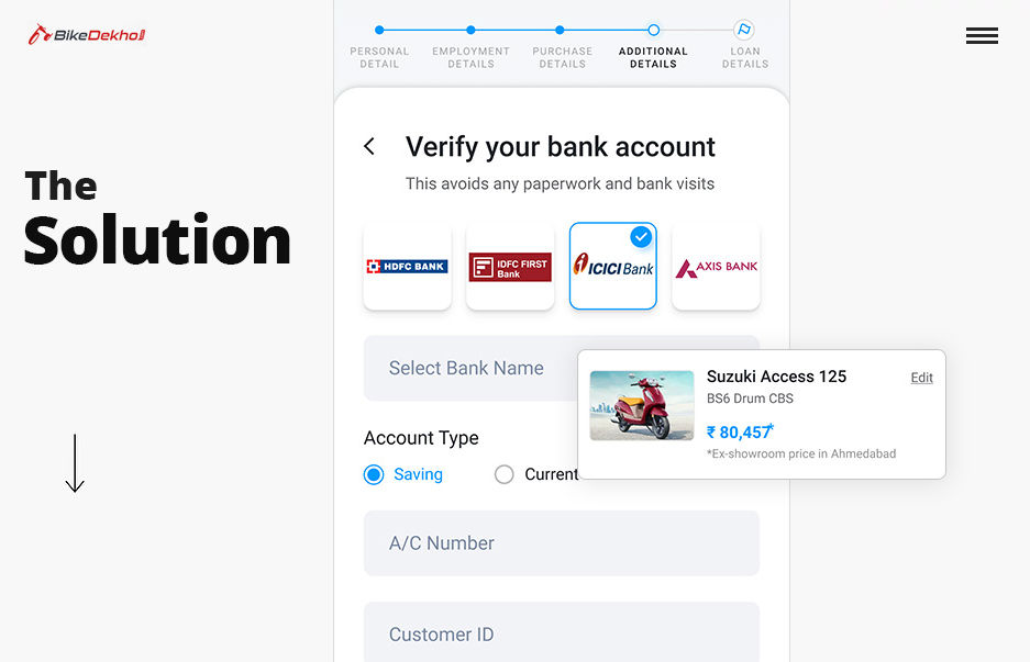
I started creating the information architecture and low-fi concepts for primary use cases. After having a go-ahead from the Product Manager, developers, and Stakeholders on the mockups, we began to conduct usability tests with the low-fidelity mockups. Once we had confidence in the design, we began digitalizing designs.


Web & Mobile
I'm a paragraph. Click here to add your own text and edit me. It’s easy. Just click “Edit Text” or double click me to add your own content and make changes to the font.

Web & Mobile
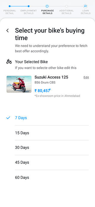
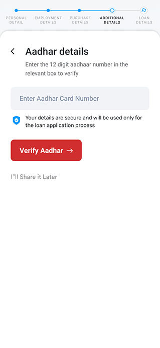
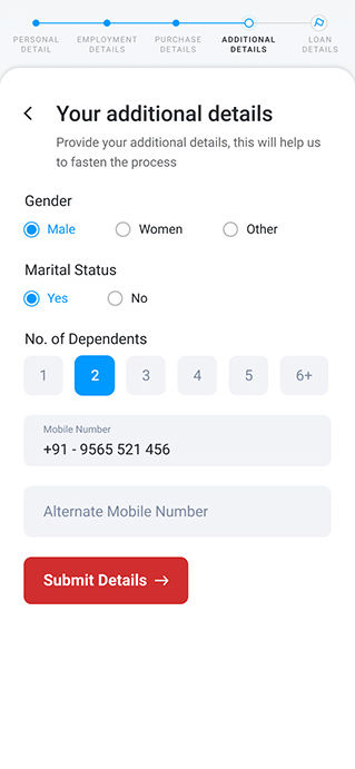
During the design execution, I divided the concept into web and wap/mobile and stages based on the key pain points and challenges.





Seeing Results
We released the app update in September and are excited to be pulling in data and using it to make more informed design decisions.